

There’s been a lot of talk lately about the “K-shaped economy.” The idea of a K-shaped economy is that one group of consumers is moving up while another is moving down. Higher-income households continue to benefit from rising incomes, home values and financial assets, while lower-income households are dealing with inflation, debt, housing costs and less room in their monthly budgets.
You can certainly find examples that support a K-shaped economy in 2026. Luxury travel and premium products are doing well. Higher-income homeowners are still taking on large remodeling projects, while other consumers are trading down, becoming more price sensitive or delaying purchases. In our Q2 2026 Contractor Activity Tracker, conducted in partnership with The Home Improvement Research Institute, roughly 60% of contractors reported dealing with canceled or postponed projects.
So, the K feels plausible, but I wanted to know whether the data actually supports it. The answer is: yes…and no. There is clearly separation in parts of the U.S. economy, but, upon a deeper dive into the data, the overall picture is a lot less clean than the K makes it sound.
Home Improvement Spending Trends: a K-Shaped Economy?
The highest-income homeowners spend a lot more on their homes-nearly 4x more than the lowest quintile. According to the 2023 American Housing Survey homeowners in the lowest income quintile spent an average of about $2,300 annually on improvements, compared with about $9,100 among homeowners in the highest income quintile.
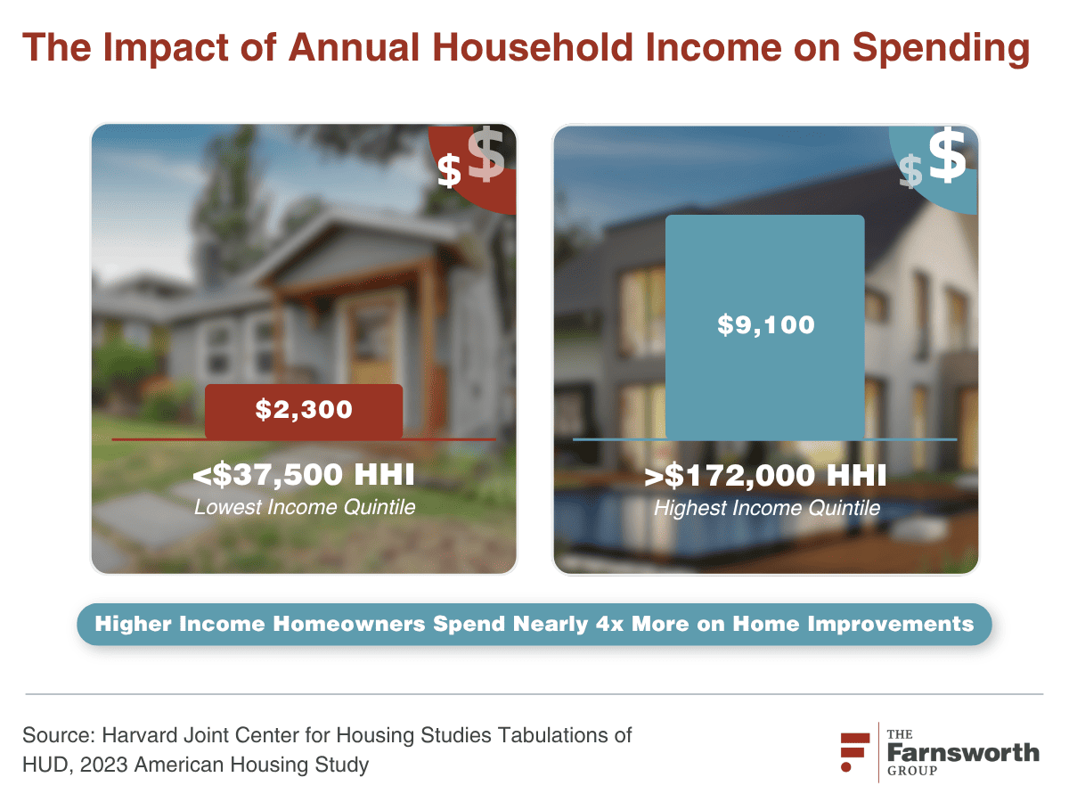
It would be easy to look at that chart and say, “There’s the K.” But the shape of the K has to show us something else-both growth and separation for high and low income. Higher-income households have always spent disproportionately more on home improvement, so the fact that they spend more today doesn’t really tell us whether the market is becoming more K-shaped.
Some things we already know about the top 20% of income households:
- They have more discretionary income
- They generally own more expensive homes and can replace something because they want to rather than because they have to
- They have also consistently accounted for roughly half of home improvement spending
Between 2015 and 2023, the income required to enter the top income quintile grew at roughly the same annual rate as median household income. So income tells us higher-income households spend more, but it doesn’t necessarily tell us the gap is widening in the way a K-shaped economy would suggest.
What Does a K Actually Look Like?
Before we decide whether the market in 2026 is K-shaped, it helps to look at a period when the data really did look like a K.
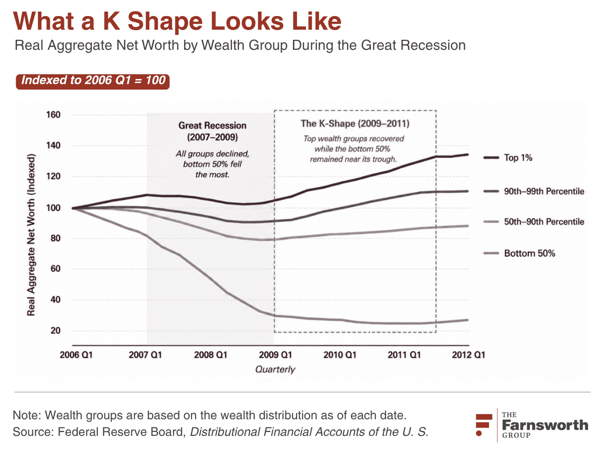
The K-Shaped U.S. Economy from 2006-2012
If you want to see a K-shaped curve, here’s your chart, but it’s not today’s data. From roughly 2006 through the aftermath of the financial crisis, wealth for the bottom half fell sharply while wealthier groups were much better insulated.
Federal Reserve data show aggregate net worth for the bottom 50% falling from about $1.48 trillion in early 2006 to roughly $0.33 trillion by late 2009, and it continued lower into 2010–2011 – the bottom fell out of the bottom. This is what the lower arm of the K actually looks like: the lower group isn’t just growing more slowly, it’s going the opposite direction.
During that timeframe, the main reason was housing.
Why Housing Was the Lever During the Great Recession
Going into the housing crash, lower- and middle-income households had much more of their assets tied up in their homes than the highest-income households did. According to the 2007 Survey of Consumer Finances, primary residences represented roughly 45% to 52% of total assets for much of the bottom 90% of the income distribution, compared with about 20% for the top 10%.
When home prices collapsed, those households lost a much larger portion of their asset base. And, of course, the banks did not reduce mortgage balances just because home values declined. Home equity was hit from both directions.
That period gives us a pretty good benchmark for what we mean when we say “K-shaped.” One group held up or recovered faster while another group actually lost wealth.
So what happens if we apply that same test to today?
Is there a K-Shaped Economy When We Reset the Index to 2020?
Instead of looking all the way back to 1989, let’s reset the same wealth groups to 2020, the beginning of the COVID period, and ask the question again.

This is where the K breaks down. Not only do the groups do not move at the same rate, but we also don’t have one large group moving up while another large group moves down.
The top 1% continues to gain wealth. The next 9% grows too. The broad middle grows at a different pace. And the bottom 50% has also increased (not decreased) its real wealth from the 2020 baseline.
So we have growth. We have some separation. But we don’t have the lower arm of the K moving downward.
That doesn’t mean everyone is doing equally well. It means something different: the groups are following different growth paths.
CAGR Tells Us the Same Thing
Indexed charts like the one above are useful because they let us see the shape of the change, but they can also make a rebound from a low base look especially steep. So it helps to check the visual against the compound annualized growth rate (CAGR) over the same period.
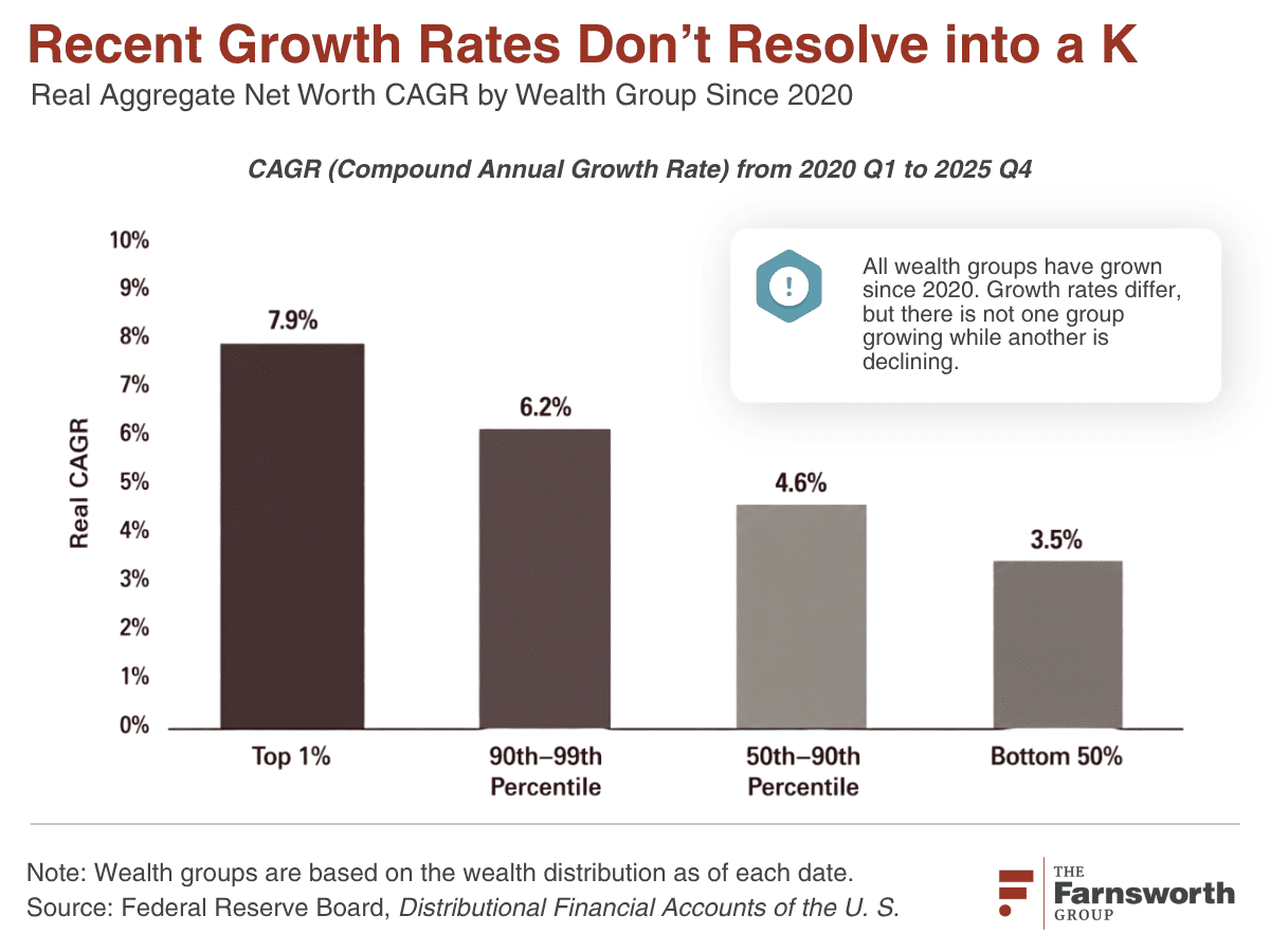
The CAGR comparison should tell us who has actually grown fastest since 2020 without relying on the slope of the indexed lines. We may find that the top is growing faster over the full period, while the bottom is showing strong growth off a much smaller base and the middle groups are growing more steadily.
That may not give us a neat letter at all…but it also doesn’t give us a K.
So What Are We Actually Seeing in 2026?
A common way to describe the K-shaped economy is that “the rich are getting richer and the poor are getting poorer.” This simply does not bear out with the data. The fact is, In inflation adjusted terms, every broad wealth group is getting richer, but the ultra-rich ($11-14 Million in net worth) are getting richer much faster than everyone else.
What does this mean for the home improvement and building products sector?
For home improvement, I think the more useful question is financial flexibility. One homeowner can move forward with the project as planned. Another can still do it, but may reduce the scope, trade down, finance more of it or wait six months. Another may postpone the project altogether.
That matters for manufacturers, retailers and contractors because the question becomes less about whether a customer is “high income” or “low income” and more about what kind of flexibility they have when the project gets expensive.
Do you feel confident that you know how your customer base is behaving given these current market dynamics?
- Can they absorb a price increase?
- Will they trade down to a different material or brand?
- Will they cut part of the project?
- Finance it?
- Do more of the work themselves?
- Or simply wait?
Responding to Current Market Dynamics
These outcomes affect product mix, good-better-best strategies, financing offers, promotions, assortments, messaging and even how to be thinking about innovation. A premium product may still have a market, but the reason someone pays more for it may need to be clearer. A value product may gain share, but not necessarily because the customer has stopped spending altogether. They may simply be reallocating the budget.
I'm not sure what letter we're looking at right now...it's not a K, or even an E. Maybe rather than trying to find a letter to describe the market, the better takeaway is that the market is more segmented than the K makes it sound. For home improvement and building products, understanding where the consumer still has flexibility, where they are making trade-offs, and where the project stops altogether is probably much more useful than trying to make the data fit the shape.
Getting answers to each of the scenarios above is where our market research experts at The Farnsworth Group can help. Then, equipped with data unique to your company’s opportunities and risks, you can ensure that your company grows alongside these ever changing market trends.

Frequently Asked Questions
Quick answers to the most common questions about the K-shaped economy and what the data means for the home improvement and building products sector.
What is a K-shaped economy?
A K-shaped economy is one in which different groups of consumers move in opposite directions at the same time, one arm rising while the other falls. In the usual framing, higher-income households keep gaining from rising incomes, home values and financial assets, while lower-income households fall behind due to inflation, debt and rising housing costs. The defining feature is not simply that the two groups grow at different speeds; it is that one group actively loses ground while the other advances.
Is the U.S. economy really K-shaped in 2026?
The data does not support a true K-shaped economy in 2026. While there is clear separation between income groups, no large group is losing wealth. In inflation-adjusted terms, every broad wealth group, including the bottom 50%, has grown its real wealth since the 2020 baseline. The ultra-wealthy (roughly $11–14 million in net worth) are simply growing much faster than everyone else. That points to a more segmented economy following different growth paths, not the downward-moving lower arm that defines a real K.
What did a real K-shaped economy look like?
The clearest recent example was 2006 through 2012. Federal Reserve data show aggregate net worth for the bottom 50% falling from about $1.48 trillion in early 2006 to roughly $0.33 trillion by late 2009, and continuing lower into 2010–2011, while wealthier households were far better insulated. That is the lower arm of the K: one group did not just grow more slowly, it moved in the opposite direction. Housing was the main lever, because lower- and middle-income households held far more of their assets in their homes than the highest earners did.
How much more do high-income households spend on home improvement?
High-income homeowners spend roughly four times more on their homes than the lowest-income group. According to the 2023 American Housing Survey, homeowners in the lowest income quintile spent about $2,300 annually on improvements, compared with about $9,100 among homeowners in the highest quintile. But higher-income households have always spent disproportionately more and have consistently accounted for roughly half of all home improvement spending, so a spending gap by itself does not prove the market is becoming more K-shaped.
What does the K-shaped economy debate mean for the home improvement and building products sector?
For home improvement and building products, the more useful question than “high income versus low income” is financial flexibility. One homeowner can move forward with a project as planned; another can still do it but may reduce the scope, trade down, finance more of it or do more of the work themselves; another may postpone the project altogether. For manufacturers, retailers and contractors, understanding where customers still have flexibility, and where projects stop altogether, matters more than a household’s income tier when deciding on product mix, good-better-best strategies, financing offers, promotions, assortments and messaging.
How should companies respond to current market dynamics?
Rather than trying to fit the market to a single letter, companies should focus on how their specific customer base is actually behaving. The key questions are whether customers can absorb a price increase, will trade down to a different material or brand, will cut part of the project, will finance it, will do more of the work themselves, or will simply wait. Answering these with data unique to your company’s opportunities and risks, the custom market research The Farnsworth Group provides, helps ensure your company grows alongside these ever-changing market trends.

Contributors

Eric Voyer
Eric brings nearly 30 years of experience in market research, business development, and strategic consulting within the home improvement, building products, and outdoor industries. He spent decades in syndicated research for consumer durables, where he helped leading brands turn complex data into actionable insights that drive growth. Eric's expertise spans both quantitative and qualitative methodologies. At The Farnsworth Group, Eric focuses on client engagement, project design, and strategic storytelling to ensure insights lead to clear, confident decisions.
Originally from Orlando and now based in Louisville, KY, Eric studied Business at Transylvania University, where he also competed as a collegiate goalkeeper. Outside of work, Eric still enjoys playing soccer, loves to Ski and Scuba and has a new passion for playing ice hockey.